
Context & challenge
PayPal's financing option existed on Google Store Australia, but only as a standard gateway, surfaced for the first time at the payment step — the last screen in a six-step purchase funnel (home, product page, config, basket, checkout, payment). It carried no value-driven messaging and did nothing to influence a purchase decision before that point, underserving a payment method Australian shoppers already trust.
Role & contribution
Senior UX/UI Designer, working with Matt (Creative Director), Lauren (Copywriter), and Lexter (Production Lead).
Research & insights
Market data made the case for moving PayPal earlier in the funnel: a third of Australians say they couldn't manage their finances without BNPL, and Australians are 82% more likely to purchase from a site that offers it. AU shoppers specifically are 116% more likely to buy from a site offering PayPal Pay in 4, and roughly half of users who switch to it do so because it carries no late fees — a direct point of difference against Afterpay and Zip.
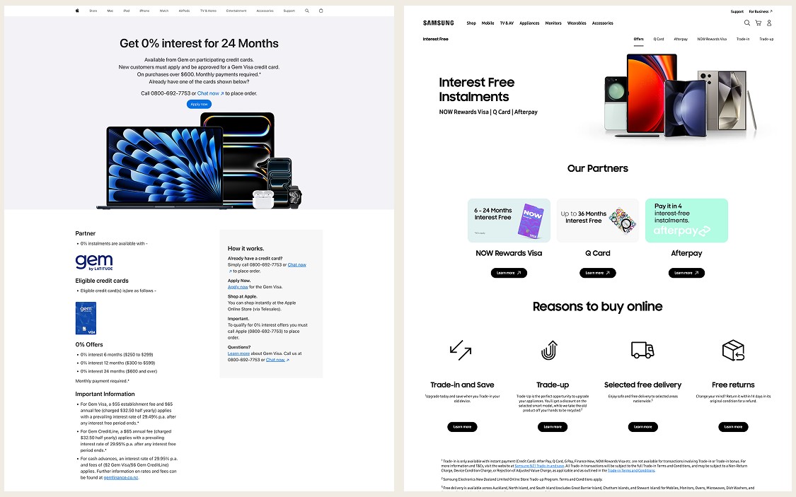
Competitor benchmarking against Apple and Samsung, the two dominant players in a category where Google Store holds roughly 4.5% share, showed both getting BNPL wrong in different ways. Apple's financing option isn't referenced anywhere on the desktop homepage, menu, or support page, is buried up to two clicks deep on mobile, and requires a specific credit card that can't be used online. Samsung surfaces no indication that financing exists until the last module of the phone category page or the final stage of checkout, at which point it presents six payment options at once. Neither treats financing as something worth explaining upfront.
Design strategy & approach
The opportunity was to do what neither competitor did: make PayPal visible early, keep the page simple enough that the offer reads as one clear choice rather than a wall of options, and frame it as a budgeting tool rather than a sales gimmick.
Wider research into other Australian retail categories reinforced the visibility argument: brands like Paspaley and R.M. Williams surface payment icons in footers and product pages rather than burying them at checkout, and The Iconic keeps finance messaging present through the entire consideration phase, not just at the point of sale.
Solution
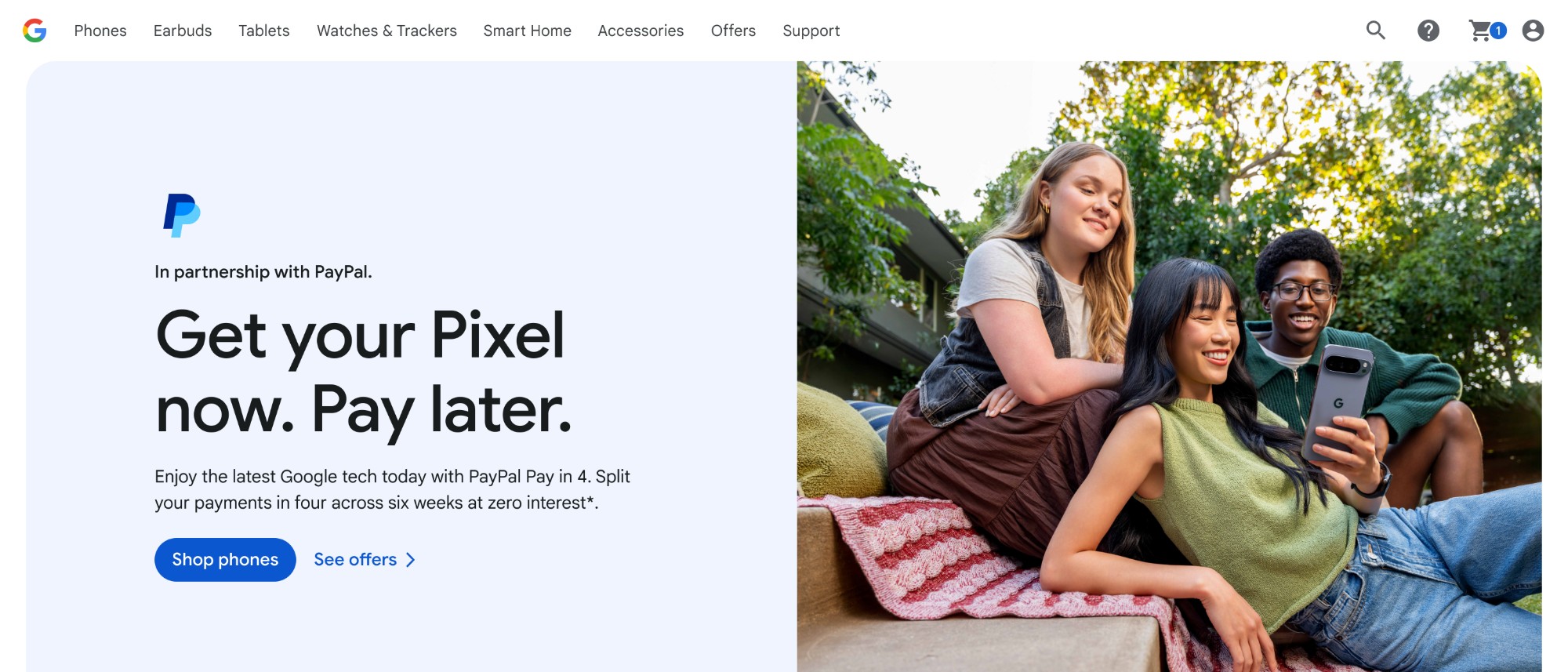
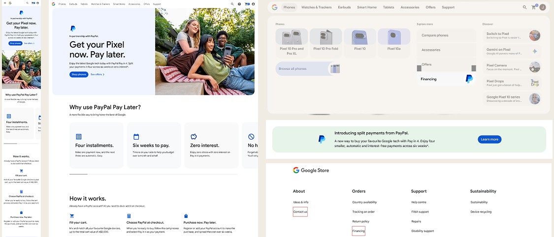
The magazine page follows a defined hierarchy: a 50:50 hero module stating the offer plainly, a process module walking through how to use it, a benefits module covering installments and zero interest, a product coverage module that reframes the A$2,000 cart limit as room to expand a purchase rather than a restriction, a product carousel, an EVP module, and an FAQ module adapted from PayPal's own Pay in 4 questions.
Beyond the magazine page, routing was added at three points in the existing funnel: a storefront-level promo module and footer link, a module in the phone category page positioned to appear after users have already compared phones, and a proposed cart CTA on the product page showing a per-fortnight payment estimate — the pattern Google Store India already uses.
Reflection & learnings
The clearest lesson from the competitor benchmarking was that "simple" and "hidden" aren't the same thing. Apple's page is simple but invisible; Samsung's is thorough but buried. The goal wasn't to add more information, it was to move the right amount of it earlier in the journey.