B4B Admin: Modernising Team Management for Business Travel
Context & Challenge
Booking.com for Business's growth strategy depended on expanding team size within existing accounts, not just acquiring new companies. The reason: internal data showed a direct, measurable correlation between team size and booking volume. Accounts with 100+ users generated 156 bookings per month. Single-user accounts generated 2.7.
The lever for growth wasn't just acquisition. It was activation, getting existing admins to successfully expand their teams. The team management tool was the direct blocker.
Role & My Contribution
My scope and the value hypothesis
As lead UX designer, I owned the full team management experience across research, design, and delivery, working across product, engineering, and data.
Value hypothesis:
If we reduce friction and confusion in admin workflows, admins will successfully invite and manage more colleagues. Larger teams mean more active users, which directly increases booking volume per account, contributing to Booking.com for Business's organic growth strategy.
Success criteria:
- Increase the rate at which admins complete team invite flows (leading indicator)
- Increase the number of active users per account post-invite (outcome, linked to booking volume)
Research & Insights
What I did and what it produced
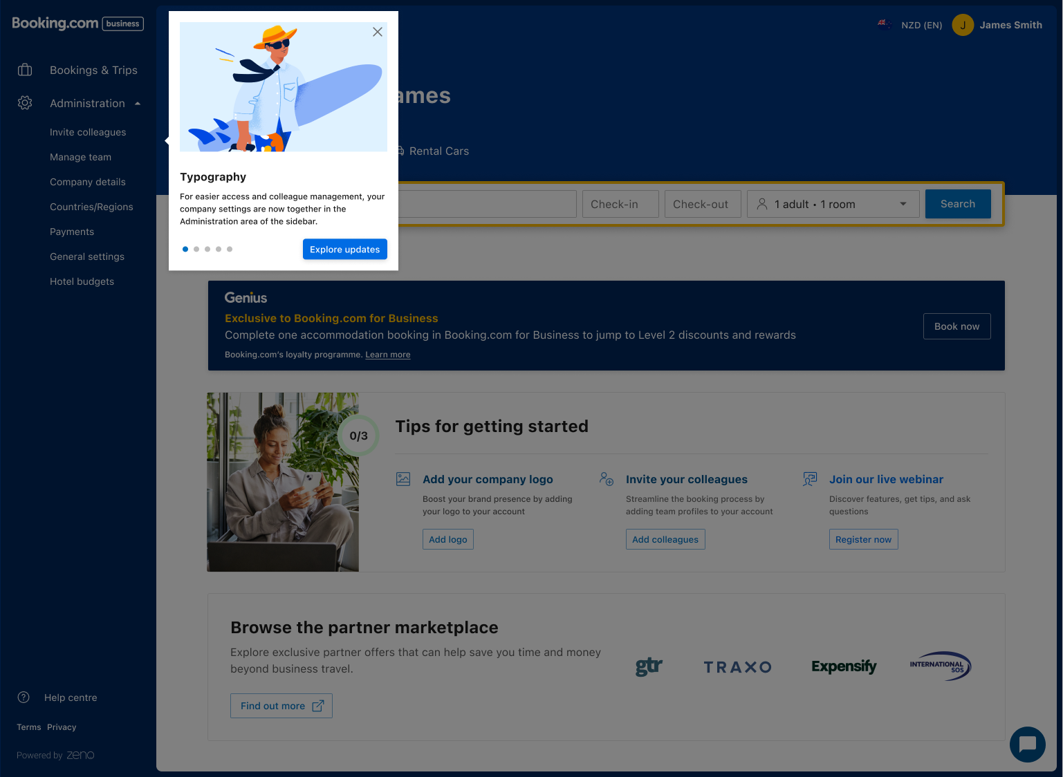
Research first: analysed usage patterns, error logs, and ran qualitative sessions with real admin users. This surfaced four concrete pain points, inefficient workflows, unexplained errors, lack of guidance on complex functions, and UI inconsistencies that eroded trust.
From there, I structured delivery into two phased releases to manage scope and reduce engineering risk:
Release 1: Restructured navigation, removed redundant functions, established a clearer hierarchy.
Goal: reduce cognitive load before introducing new interactions.
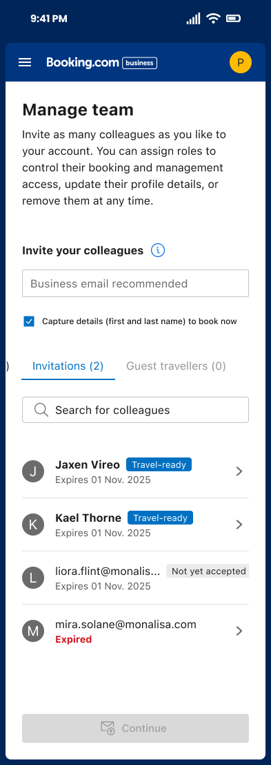
Release 2: Redesigned team and guest management flows. Clearer invite flows, better search and filter tools, consistent state and error messaging, alignment with the broader Eos platform system.
Interactive prototypes validated micro-interactions before development. Iterative usability testing shaped refinements at each stage.
1
Goals & Objectives
Simplify admin workflows so users feel in control
Reduce confusion by aligning UI with clear interaction standards
Increase engagement with team functions
Improve the onboarding and daily use experience for business users


2
Design Strategy
We broke the problem into phased releases:Release 1: Restructured navigation, removed redundant functions, established a clearer hierarchy. Goal: reduce cognitive load before introducing new interactions.
Release 2: Redesigned team and guest management flows. Clearer invite flows, better search and filter tools, consistent state and error messaging, alignment with the broader Eos platform system.


3
Solution
The new design:
- Consolidated navigation to reduce friction
- Made primary actions obvious and predictable
- Clarified states and error messaging to reduce user uncertainty
- Enhanced consistency with other parts of the Eos platform UI
Interactive prototypes were used to validate transitions and micro-interactions before development, and iterative usability feedback influenced refinements.

Results & Impact
Post-launch engagement metrics showed significant uplift across all tracked actions:
Action
Change

Invite colleagues
+805%
Manage team actions
+166%
Manage Team Actions
+161%
General settings use
+139%
payment section
+189%
RUC/Reg section
+142%

Learnings & Reflection
This project reaffirmed the value of early research and iterative validation in enterprise workflows. Clarifying structure and language in admin tools significantly boosts confidence and efficiency — even without adding major features. A strong collaboration rhythm between product, UX and engineering was key to success.
Design