B4B Registration Designing Trust at the Entry Point
Context & Challenge
Booking.com for Business was focused on user acquisition through trust. The hypothesis: friction in the onboarding flow was a direct blocker to conversion. A user who can't register themselves is a user who doesn't adopt the platform, and doesn't generate revenue.
The strategic goal was growth. The onboarding was identified as the key lever.
Role & Contribution
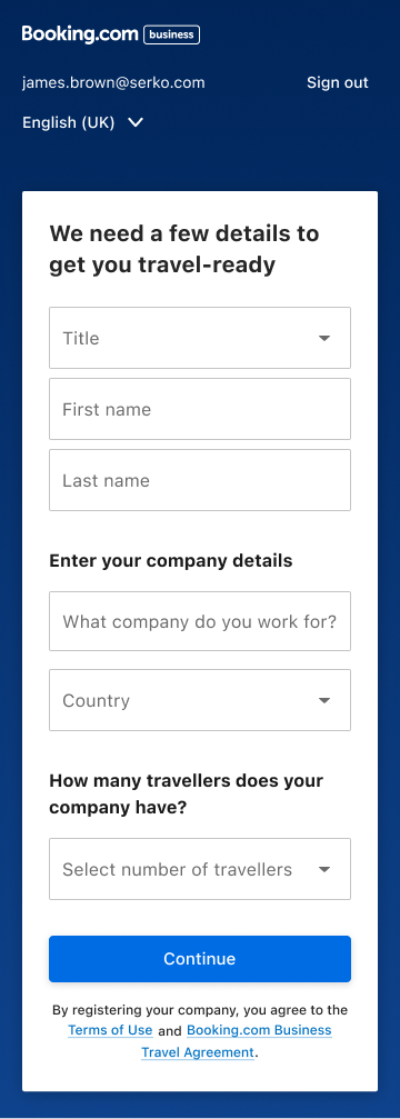
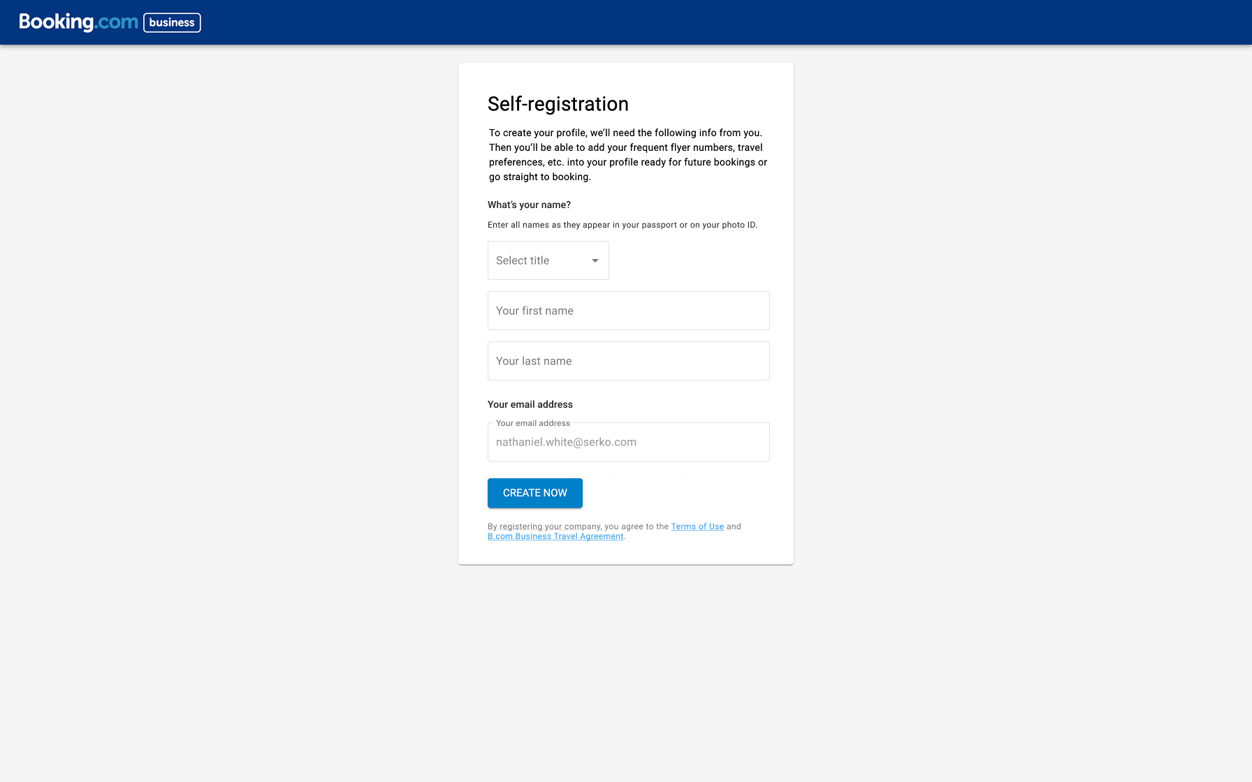
As the lead designer on this project, I was responsible for redesigning the B4B registration flow end-to-end, from research to an MVP shipped in production.
Value hypothesis: If we reduce the time and error rate during onboarding, users will successfully complete registration, build early trust in the platform, and convert to active users, directly contributing to Booking.com for Business's acquisition and retention targets.
Success criteria (defined upfront, not after):
- Reduce task completion time by 50%
- Reduce error rate by 20%
Research & Insights
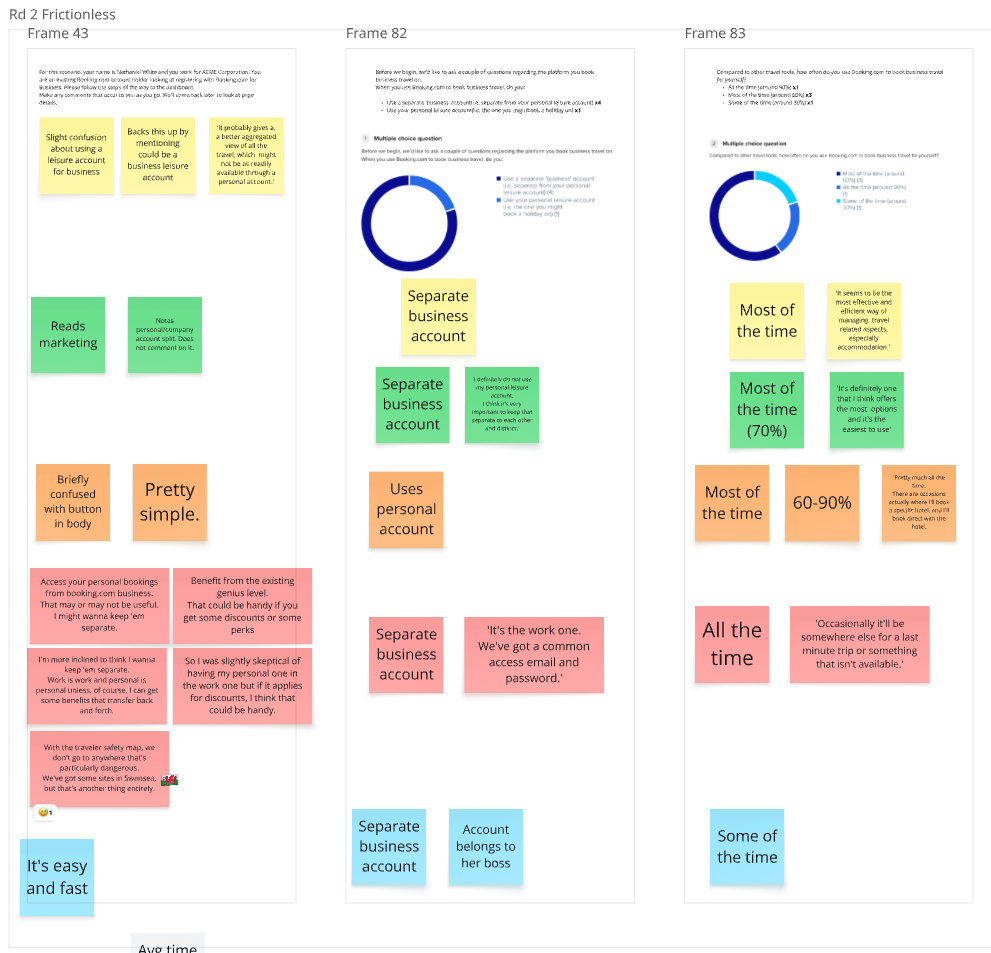
The work started with depth, not assumptions. Over 20+ moderated usability testing sessions, I identified where and why users were failing, not just that they were failing.
From there:
- Synthesised research into actionable insights that informed a north star vision, a reference point to align the team and stakeholders throughout the project
- Descoped aggressively: removed features that wouldn't deliver immediate onboarding value, reducing complexity for both users and engineering
- Built AI-powered prototypes to run usability tests faster and at higher fidelity than traditional wireframes
- Launched an MVP in parallel with the live control, a proper A/B structure that allowed us to attribute outcomes directly to the new design, not to external noise
1
Goals & Strategic Objectives
- Reduce drop-off across registration stages
- Increase perceived trust and clarity
- Improve completion confidence
- Align onboarding UI with the broader Eos ecosystem


2
Design Strategy & Approach
We restructured the experience around:
- Progressive disclosure
- Clear state feedback
- Visible progress markers
- Language simplification
Rather than compressing the flow, we optimized cognitive load and clarity per step.

3
Solution
- Redesigned step logic with clearer grouping of information
- Improved validation states with actionable error messaging
- Introduced clearer progress tracking
- Reduced redundant input friction
- Standardized UI patterns to align with platform design system
The experience shifted from transactional to guided.

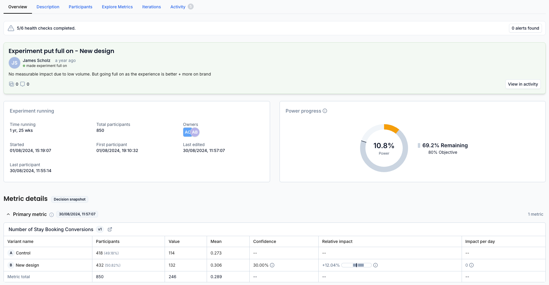
Results & Impact
Measurable contribution to business objectives
Metric
Control
New Design
Change

Errorrate
18.5%
8.7%
-53%
Task completion time
40+ secs
21.5 secs
-46%
Both success criteria were met, and exceeded.
The error rate target was 20% reduction; we delivered 53%. The time target was 50% reduction; we delivered 46%.

Reflection & Learnings
This project reinforced that onboarding is not a form problem, it’s a confidence architecture problem.
It also informed internal standards around error messaging and progressive disclosure patterns now reused in other flows.
Future iterations could incorporate adaptive onboarding based on company size and role segmentation.
Design