Unleashed Dashboard: Operational Clarity at Scale
Context & Challenge
The Unleashed dashboard served inventory-heavy businesses managing complex supply chains. Data was abundant but lacked prioritization.
Users weren’t struggling with access — they were struggling with meaning.
Role & Contribution
The Unleashed dashboard served inventory-heavy businesses managing complex supply chains. Data was abundant but lacked prioritization.
Users weren’t struggling with access — they were struggling with meaning.
Research & Insights
- Users relied on external spreadsheets
- Critical metrics were buried
- Cognitive overload slowed decision-making
Insight: dashboards should reduce interpretation time, not increase it.
1
Goals & Strategic Objectives
- Improve signal-to-noise ratio
- Increase daily dashboard engagement
- Reduce dependency on external exports


2
Design Strategy & Approach
We prioritised:
- Data hierarchy
- Progressive detail
- Modular card architecture
- Clear visual weighting


3
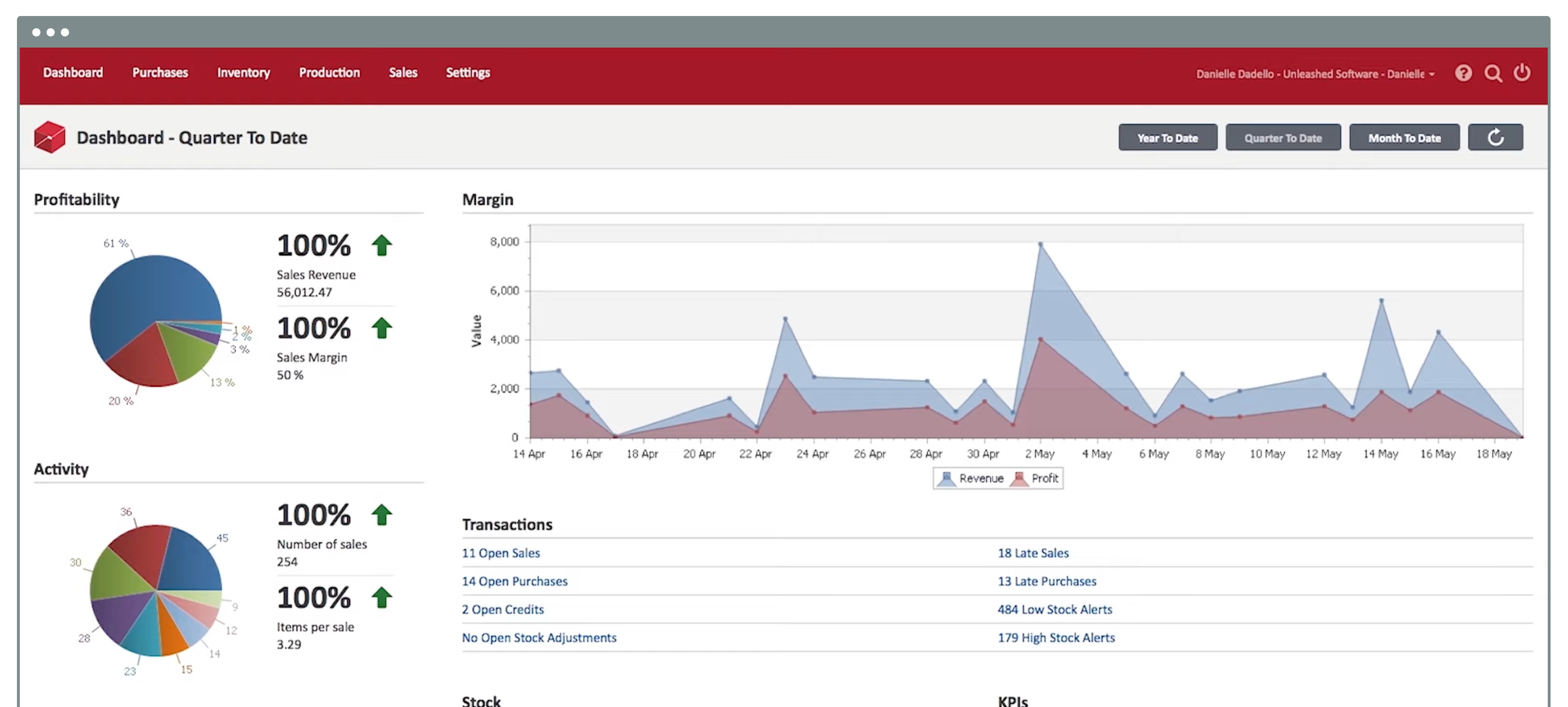
Solution
- Reorganised KPI structure
- Introduced modular dashboard widgets
- Improved filtering and drill-down interaction
- Enhanced visual consistency and scanning clarity

Results & Impact
- Increased dashboard engagement
- Reduced export reliance
- Improved user confidence in operational insights
Reflection & Learnings
- Data-heavy environments demand ruthless prioritization.
- This project reinforced the importance of designing for decision speed, not data density.
- Future direction: predictive alerts and anomaly surfacing.
Design